Drawing aryse
A marker sketch, a day spent turning it into rules, a pen picked up again, and a sun that turns. How our wordmark was made.
- Brand
- Aryse, coffee, design, and community. Ahmedabad.
- Role
- Founder, designer
- Scope
- Wordmark, a tool of rules, motion
- From
- One marker sketch
A mark at the same stage as the brand
Aryse is coffee, design, and community. Underneath it sits one belief: nothing of value is manufactured. Coffee takes its character from where it's grown. Design takes its character from the hands that make it. A community takes its character from who's in the room.
The name reads as arise. Morning, getting up, something growing. I didn't pick it for that, but I didn't want to waste it either.
We're young. The coffee is still being sourced lot by lot, and the café is a few years away. A frozen logo would have been the most finished thing about us. So the brief was simple: a mark that is clear about what it is today, and can keep moving.
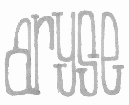
It started with a marker
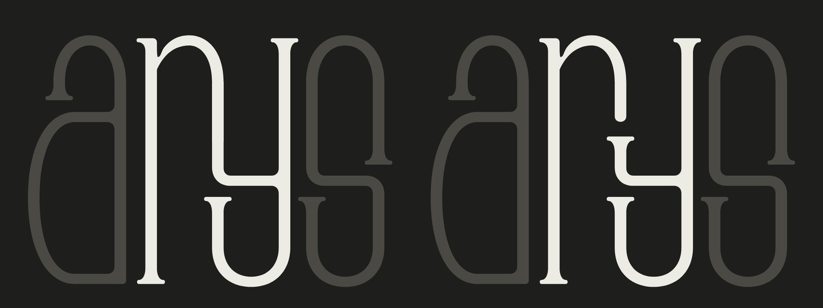
Five letters, tall and narrow, all inside one height. Even the y. Its tail doesn't drop below the line. It folds back up into the same box as everything else, so the word reads as one block.
The serifs were there for character. So was the uneven hand. A sketch carries an idea, but it can't be consistent, it can't scale, and it can't move. The usual next step is to trace it. I wanted to measure it first.
Finding the decisions that repeat
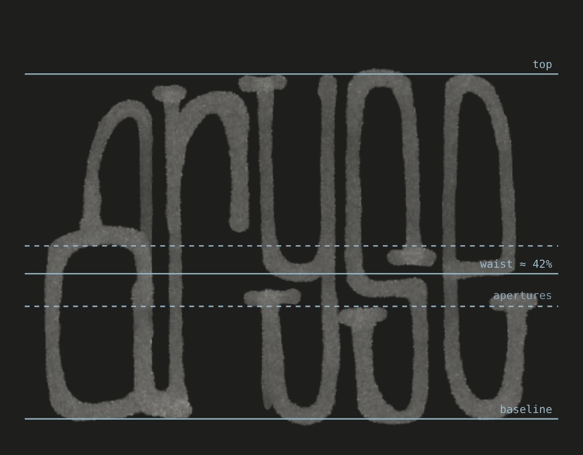
Measured, the sketch kept making the same few choices. The y, the s and the e all hinge on one horizontal line a little below the middle. Every terminal stops just short of it. The arches are deeper than they are wide.
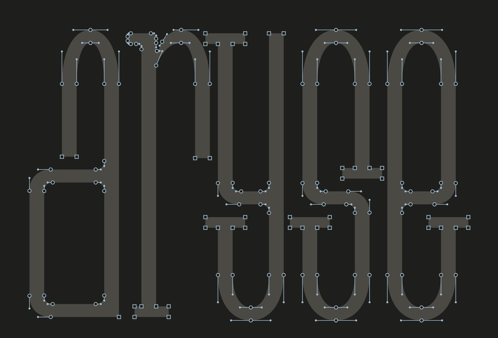
Each of those became one number the whole word shares. Then I built a small tool around them: about forty settings for weight, widths, that shared line, the apertures, arch depth, corners, serifs, and how the r meets the y. Every letter is its own path, built so that points sit on the extremes of each curve and every handle is level or upright.
Three things I only saw once the rules were moving
The top of the a ran straight into its counter. I wrote it down as plainly as I felt it:
The top of the a is completely touching its counter, and that isn't working.
The arm now stops short, and the gap it leaves is the same size as every other aperture in the word.
I joined the r's arm into the y's left stem as one shared line. It looked good, and people read it as a p, or an N. When a stroke runs on into another, the eye joins them. The r needed to visibly stop. So it ends, there's a gap, and the y begins.
At 18 pixels the s and the e closed into loops and the word stopped reading. Punchcutters dealt with this centuries ago by cutting small type heavier and more open. The tool got the same idea: one setting that opens and weights the mark for the size it's seen at.
Then I put the tool down and drew it again
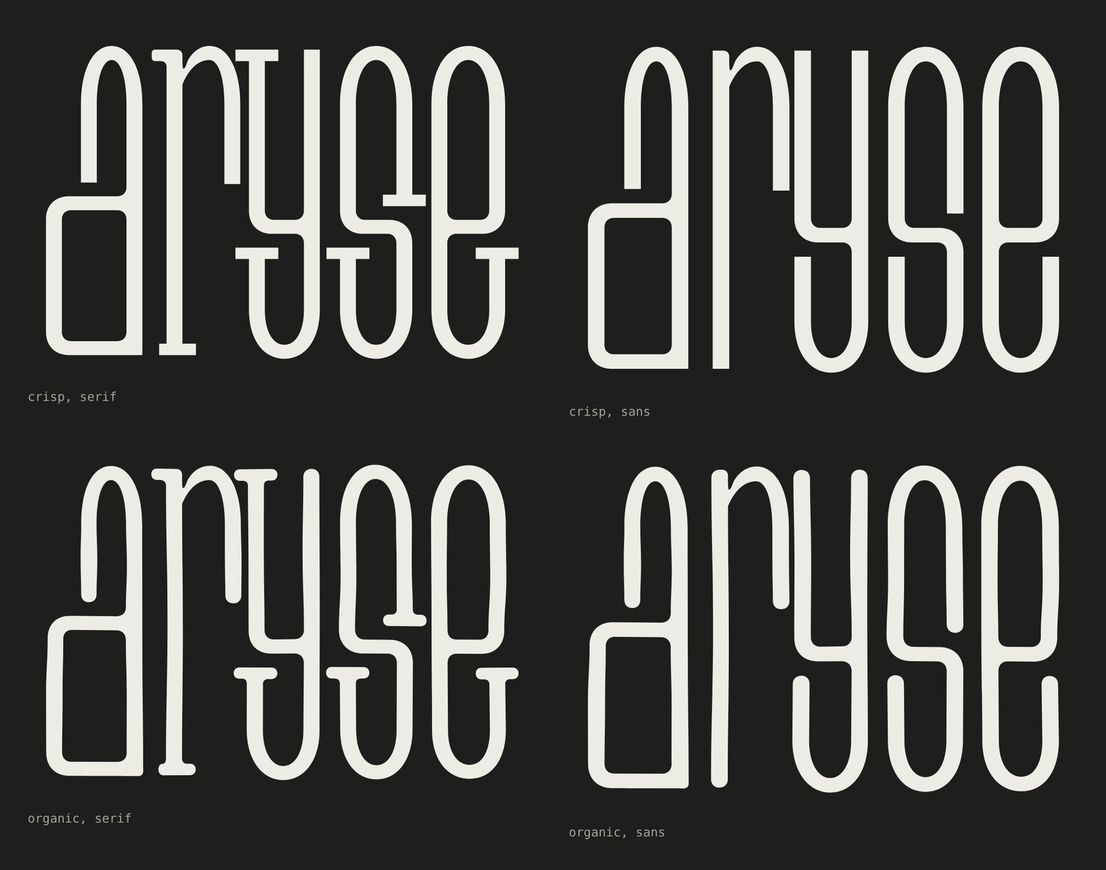
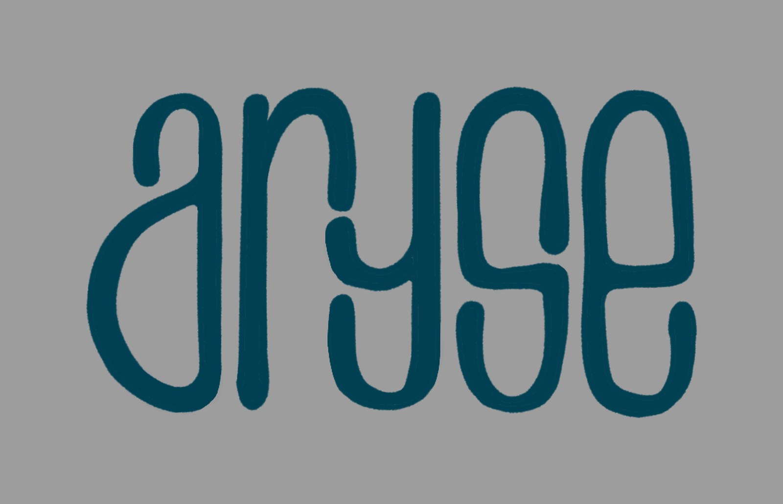
A day of rules gave me a clean mark. It also gave me a mark that felt a little too sure of itself. So I picked the pen back up and drew it again, with two things no slider had: a slight weight gathering at each terminal, and a quiet contrast running through every stroke.
That drawing went back into the tool to be refit. The a's upper arm was out of balance and the r's shoulder wasn't smooth, so those were fixed against it. Then I drew the final file myself, keeping only what had survived both passes. The serifs went. The rules stayed.
Four numbers hold it together
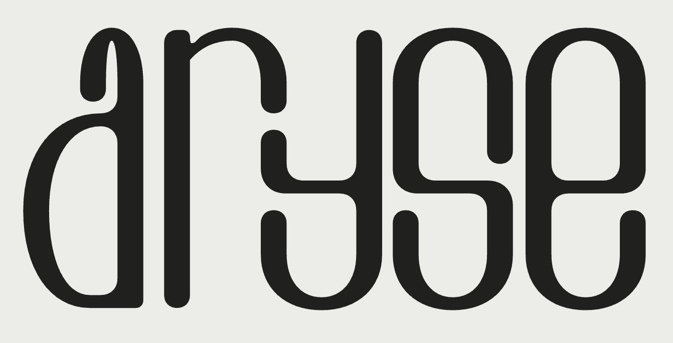
Every upright is 37.38 units wide. Every horizontal is exactly half that. The stress is vertical, like a broad pen held flat, so the curves are full at the sides and thin at the top and bottom. Every bowl is the same: straight sides, with a round end of radius 93.45. Every open stroke ends in a half circle.
The line the sketch kept finding is still there. The joint of the y, the spine of the s and the bar of the e all sit on one band, about 42% of the way up. All five letters live inside one height, and the round ones dip 3.74 units below the line so they look level with the flat ones.
Three ways of moving it that didn't work
The name asks for motion. I wanted the mark to rise like the sun, so I tried it three ways.
- The letters started as dashes on a horizon and grew to fill the outline of a rising sun. It read as a loading bar.
- The letters stayed still while light and shadow swept across them, like the phases of the moon. It was correct, and a little polite.
- The word was pressed into whatever shade was left on the sun as the light came in. My note at the time: the letters are feeling very stupid. They were. They looked crushed, not turned.
The reference I kept going back to was a grainy loop of a sphere passing through its phases. What it had that mine didn't was a surface. The light wasn't bending anything. It was rolling across a ball.
Stop bending the type. Turn the ball it's printed on.
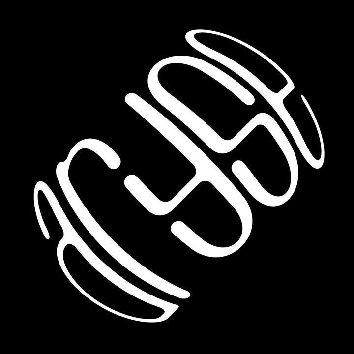
So the word went onto a sphere, wrapped round about 90% of it, and the sphere turns. As the word rolls away it narrows and thins at the edge, the way a label does on a real ball. No letter is pushed around by hand. The squeeze comes from the surface.
The ball turns on a diagonal, so the light rolls in from the top left at 45 degrees, like the reference. I tried the word level and at 45 degrees both ways. Turned to run up the axis, it tips over the edge of the ball as one piece, and that was the one.
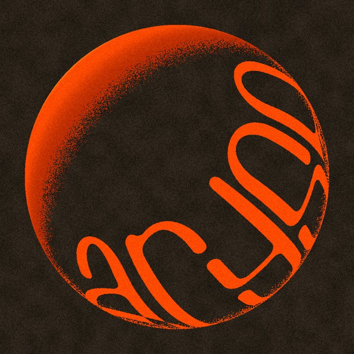

Drag the ball
This is the same projection running live on the final outlines. Drag across it, or use the slider.
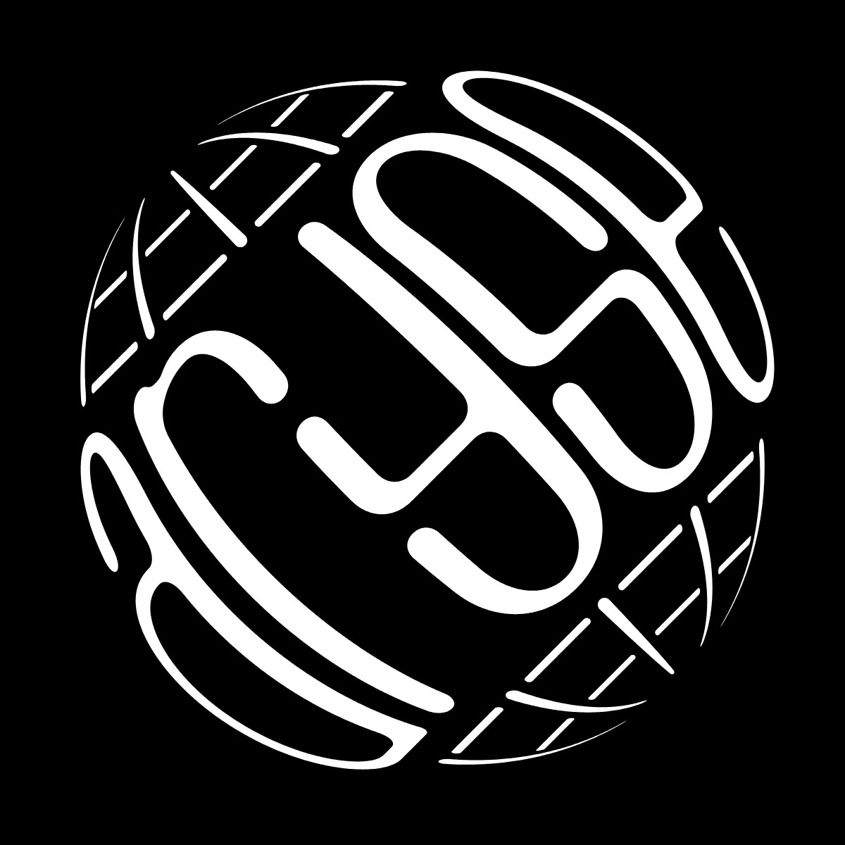
A globe drawn in the letters' hand
One frame of the turn became a still. I drew latitude and longitude on the same ball, in the same hand as the letters: the lines across the word at the weight of a horizontal, the lines along it lighter still, every end rounded like a terminal.
The grid never touches the word. A clear band runs the length of it, about one horizontal stroke wide. Where the two directions of line meet, the lighter one breaks and lets the other through.
A mountain range in the counters
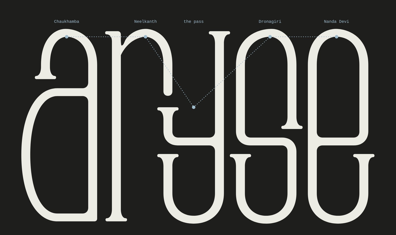
I spent a year leading treks in the Himalaya, and for a while the tall counters carried the skyline seen from Kuari Pass: Chaukhamba, Neelkanth, the pass itself in the open top of the y, Dronagiri, Nanda Devi. It was quiet enough that nobody would notice unless told.
The final drawing kept the counters plain. The ridge still lives in the tool, one setting away. Some things are better kept for the people who make the brand.
What I'd keep
- Measure the sketch before cleaning it. The decisions that repeat are the system.
- Draw the white. The a's arm, the r and the y, even the mountains: the hardest calls were all in the gaps.
- Test at 16 pixels on day one.
- When someone misreads a letter, they're right.
- Let the tool teach you, then put it down and draw. The final file came from the pen.
- In motion, move the surface the type is printed on before you move the type.
What this leans on
- Donald Knuth, METAFONT (1977–79)Letters described as rules and parameters, not fixed outlines.
- LettError, Beowolf (1990)A font that changed a little every time it printed. The root of the organic setting.
- Gerrit Noordzij, The StrokeLetters as the trace of a tool. Why the contrast here follows a flat pen.
- Fred Smeijers, Counterpunch (1996)Shaping the counter first. The case for drawing the white.
- Walter Tracy, Letters of Credit (1986)Spacing, overshoot, and why small type is drawn differently.
- DIA, Nuits Sonores identityType that stretches and turns while its structure holds. The bar for the motion.
- OpenType variable fonts (2016)One design, continuous settings. The way the tool thinks.